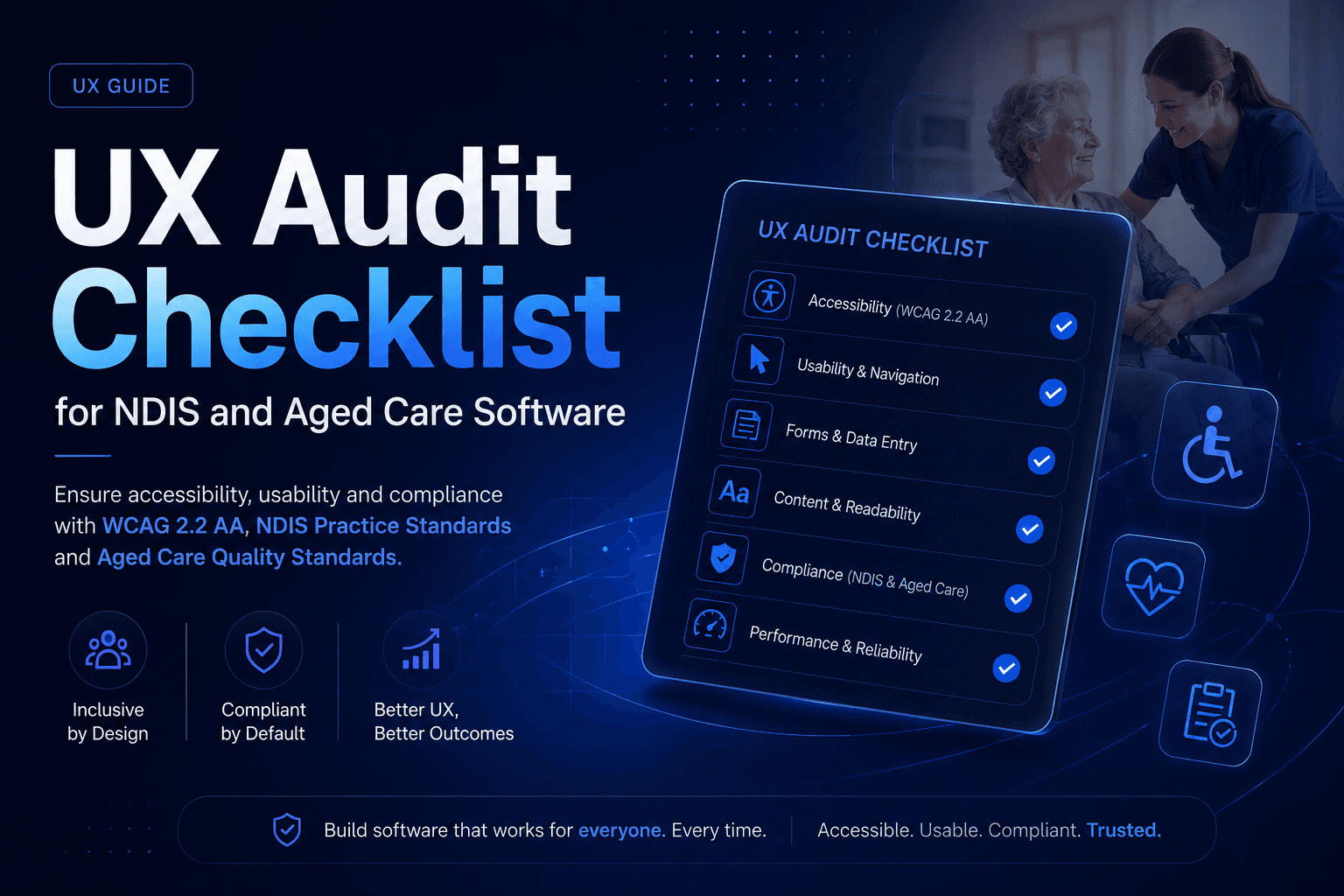
UX Audit Checklist for NDIS and Aged Care Software
A UX audit for NDIS, aged care or government software is a structured review of how well an interface works for real users, including people with disability, low digital literacy or high cognitive load, measured against WCAG 2.2 Level AA and the specific record keeping and communication obligations in the NDIS Practice Standards and Aged Care Quality Standards. It has to go beyond generic usability heuristics to check form validation, colour contrast, screen reader compatibility, focus order and session handling on the exact workflows participants, carers and staff use every day. A proper audit ends with a written report that rates each finding by severity and fix effort, not just a list of opinions.
What a standard UX audit covers, and what it leaves out
A typical UX audit combines three methods. The first is a heuristic review, usually against Jakob Nielsen's ten usability heuristics: things like visibility of system status, error prevention, and recognition rather than recall. This is fast and cheap, and it's good at catching confusing navigation, inconsistent labelling and cluttered layouts. It's not good at catching anything that only shows up when a real person with a real disability tries to use the product, because a heuristic review is one person's expert judgement, not a test.
The second method is analytics and behavioural data: tools like Hotjar or Microsoft Clarity for session recordings and heatmaps, and Google Analytics for funnel drop-off. These are genuinely useful for spotting where users abandon a task. What they can't tell you is why, and they say nothing at all about whether the interface works with a screen reader, because that data simply isn't captured.
The third method is task-based user testing, often run through a tool like Maze for quick remote sessions. This catches real task failures with real users, but sample sizes are usually small, and unless the recruitment specifically includes people with disability or low digital literacy, it will miss exactly the failures that matter most for NDIS, aged care and government software.
None of these three methods, on their own or combined, tests conformance against WCAG. For that you need either an automated scanner like axe DevTools, WAVE or Lighthouse, or a manual accessibility review. Scanners are good at machine-detectable problems: missing alt text, missing form labels, contrast ratios below the threshold. What they can't do is test anything that depends on actual interaction. A keyboard trap and a broken focus order both require a person to tab through the interface and find out, and no scanner can tell you whether a screen reader user completes a task end to end. A generic UX audit that skips this layer entirely, which is what most published UX audit guides describe, will miss the exact failures that create legal risk for compliance-heavy software.
Why compliance heavy software needs a different audit
NDIS and aged care. The people using this software span an unusually wide range of digital literacy and physical or cognitive ability, and a meaningful share of end users are the vulnerable participants themselves, not just staff. Data entry errors carry real weight here: incomplete or poorly communicated records sit directly against the Aged Care Quality and Safety Commission's Outcome 3.3, which requires providers to communicate critical information about a person's care effectively and to escalate risks and changes in condition. The NDIS Practice Standards carry a parallel obligation, requiring each participant's information to be accurately recorded, current, confidential and accessible to the participant. A UX audit for this software has to test whether the interface makes correct data entry the easy path and incorrect entry hard, not just whether it looks clean.
Government. Government-facing services carry two overlapping obligations: WCAG 2.2 AA as the accessibility baseline, and, for non-corporate Commonwealth entities, the Digital Service Standard 2.0, which extended to existing public-facing services from 1 July 2025. Criterion 3 of the DSS, "Leave no one behind," is effectively an accessibility and inclusion mandate sitting alongside WCAG rather than replacing it. An audit of government software should check against both, because passing an automated WCAG scan doesn't automatically satisfy DSS review criteria like measurability and user research evidence.
Healthcare. The stakes shift again here, towards privacy and clinical risk. A confusing results screen or an ambiguous dosage field isn't a minor annoyance, it's a clinical safety issue. Cognitive load matters more than almost anywhere else, because the person using the interface is very often unwell, anxious or exhausted, not sitting at a desk giving the software their full attention.
WCAG 2.2 AA in plain English, via the four POUR principles
WCAG is organised around four principles, and every specific rule sits under one of them. Here's what each one actually means on a real screen, not in the abstract.
Perceivable. Users need to be able to perceive the content, through sight, hearing or touch. A dashboard that flags overdue tasks by turning text red on a white background often fails this outright, because the contrast ratio between that red and white can sit well under the 4.5:1 minimum WCAG 2.2 AA requires for normal text. A colour blind support coordinator, or anyone reading the screen on a phone in bright sunlight, simply will not see the flag.
Operable. Users need to be able to operate every control, including by keyboard alone. A classic failure in aged care admission forms is a date picker widget that traps keyboard focus once opened, so a screen reader or keyboard-only user can tab in but never tab back out without refreshing the page.
Understandable. Content and interface behaviour need to be predictable and clearly explained. An NDIS claims form that responds to a rejected submission with "Error 400" instead of plain language about which field is wrong and how to fix it fails this principle, even if it's technically accessible to assistive technology.
Robust. Content needs to work reliably with current and future assistive technology. A common one: an icon-only save button with no accessible label, so a screen reader announces it simply as "button," giving a blind user no idea what it does before they activate it.
Where Australian software most commonly fails
These are the failure patterns the WCAG criteria below exist to prevent, and they are the ones that surface most often in compliance heavy platforms. The table is written to be specific enough to check against your own product directly.
| Failure | WCAG 2.2 criterion breached | Practical consequence for an NDIS or aged care provider |
|---|
| Form validation clears the whole form or shows a generic error instead of flagging the specific field | 3.3.1 Error Identification (Level A) | A support worker resubmits an entire service agreement or claim from scratch, increasing the chance of a fresh data entry mistake |
| Status badges, charts and alerts use colour combinations below the required contrast ratio | 1.4.3 Contrast (Minimum) (Level AA) | Staff with low vision miss an overdue task or a flagged risk on a participant's file |
| Custom date pickers or modal dialogs trap keyboard focus once opened | 2.1.2 No Keyboard Trap (Level A) | A keyboard-only or screen reader user gets stuck completing an admission or incident form and abandons it |
| Custom components break the logical tab order across a page | 2.4.3 Focus Order (Level A) | A screen reader user is read fields in the wrong sequence, increasing the risk of entering data against the wrong field |
| Session timeouts are too short for long compliance forms, with no warning | 2.2.1 Timing Adjustable (Level A) | Half-completed NDIS service agreements or aged care admission paperwork are lost, and the task has to start again |
| Icon-only buttons have no accessible name | 4.1.2 Name, Role, Value (Level A) | A blind user has no idea what a save, submit or escalate button does before activating it |
What a UX audit costs
Published Australian figures are limited, but they exist. UntilNow, a Sydney design agency, publishes a cost guide quoting AUD 2,000 to AUD 40,000 for a UX audit in Australia depending on scope and provider. Elsewhere on their site they put AUD 5,000 as the entry point for a basic UX audit, with full product redesign work including research, prototyping and user testing running to AUD 100,000 and beyond.
Globally, the consultancy Eleken publishes two separate bands: 1,000 to 25,000 for most UX audit engagements, and 30,000 to 75,000 for enterprise scale or heavily regulated products. Their page doesn't state a currency, so treat those as indicative rather than as Australian prices. The pattern is the useful part. Regulated work doesn't sit at the top of the ordinary range, it sits in a different range altogether.
Rather than fixate on a single number, focus on the drivers that actually move the price: whether the audit covers one workflow or the whole platform, whether it includes real assistive technology testing with users who have disability rather than just an automated scanner pass, whether you get a written remediation roadmap with effort estimates, and the seniority of whoever is doing the review. An AUD 2,000 automated scan and a five figure audit with real assistive tech users are not the same product, even though both get called "a UX audit."
What a good audit report must contain
Judge any provider's report against these five points before you pay for one.
- 1Judge any provider's report against these five points before you pay for one.
- 2A severity rating on every finding, linked either to the WCAG conformance level it breaches or to the practical harm it causes.
- 3A priority rating listed separately from severity. A low severity issue on your busiest screen can matter more than a high severity issue somewhere rarely used.
- 4A fix effort estimate in developer time or complexity, so you can actually plan the work.
- 5A retest plan. How and when each fix gets verified, not a list of problems handed over and forgotten.
Self-assessment or specialist: how to decide
A quick self-assessment using tools like axe or WAVE is genuinely useful for catching the obvious issues early, and any internal team can run one. But automated tools only catch a fraction of WCAG criteria, they can't run a screen reader the way a blind user actually would, and they carry zero legal weight if a Disability Discrimination Act complaint is ever raised, the way Maguire v Sydney Organising Committee for the Olympic Games demonstrated in 2000, when an inaccessible website was found to be a "service" under the Act.
Bring in a specialist when you're preparing for an NDIS provider re-registration audit, launching a new participant or resident-facing portal, have already received an accessibility complaint, or need to demonstrate conformance against the Digital Service Standard for a government-facing service. Beyond Himalaya Tech has delivered software in exactly these operational and regulatory contexts, including Nexa AI, a retrieval-augmented legal assistant giving cited answers on ACT tenancy law, and Rosterly, workforce and rostering software built for industries including aged care and disability support. Neither was built as a UX audit case study, but both reflect genuine delivery experience in the kind of regulated, high-stakes environment this checklist is written for.
If a similar audit uncovers usability or accessibility gaps in your own platform, our UI/UX design team can help fix them.



.JPG)